CD Artwork
CD artwork all has a similar pattern, they are all trying to catch your eye with different colours or designs, they do this to try attract as many people to look and sample the CD/album. They want this so it boosts sales mainly.
As you can see here all of the CD covers all have very interesting designs on them. All very different from one another and featuring bright contrasting colours so you are naturally drawn to them.
Often, like shown, the actual artists name isn't that obvious and the name of the album is even more obscured, again this is so more of the design of the CD cover is on show.
They do this because naturally no one is drawn to text and information while browsing for music they want eye catching graphics to look at.
Monday, 26 January 2015
Movie Posters
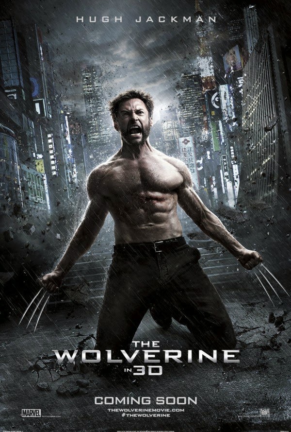
Movie Posters of the same genre of film generally have a similar layout to the image. Even though these films are nothing alike they all have the same feel to the film, quite dark and emotional, not happy or feel good films. They all use blue and cold tones to express the general vibe of the film. They all also follow a certain framing which follows as;
Main actor in the front and centre
Actors name at the top of the poster
Movie title in the bottom area of the poster.

David Samuel Stern
HE has created these images by physically cutting two images into strips and weaving the two together, this is a very different style of merging two images together and I think can look good with images with a very quiet background, anything with too much visuals would prove confusing to look at, you couldn't do this with some landscapes.
HE has created these images by physically cutting two images into strips and weaving the two together, this is a very different style of merging two images together and I think can look good with images with a very quiet background, anything with too much visuals would prove confusing to look at, you couldn't do this with some landscapes.
Matt Wisniewski
He created this image by overlaying two images, and applying a layer style so only part of the top layer is transparent, either that or he carefully erased the hand part of the second image. Doublr exposures like these can be very interesting because they have a very certain framing around the first image.
This image appears to be created in a similar way to above but part of the original image is still visible. It also appears that he has added some graphical elements to the image to outline the face and head. I really like what he's done here incorporating graphical aspects into photography.
This image looks like he's sending a message to the audience, perhaps showing how smoking can take over the mind when trying to quit or addiction to anything consumes the mind.
Subscribe to:
Comments (Atom)


