
Monday, 16 March 2015

Creating the negative sheet

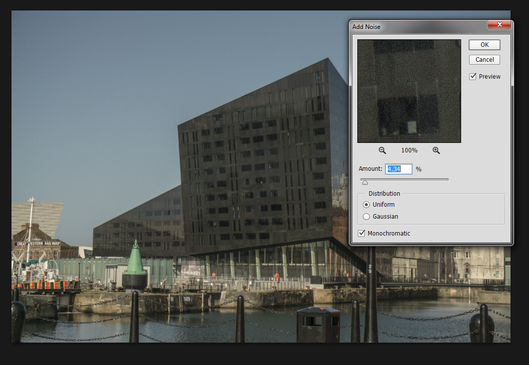
What I did then was add a noise filter to simulate film grain that you see on the old images.


I then adjusted the image so it would fit into the 35mm template.

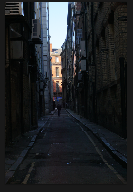
For the non raw images I took I used levels to create a similar effect as in the raw processing.

With some of the images, due to the wide end of the lens creating some distortion on the image (a slight fisheye effect at 16mm) I used a lens correction tool in photoshop when shooting architecture so it was more accurate as to what the building was actually like.


Overall I think this went quite well, and I really like the outcome of the entire piece and does have a classic, vintage style. I haven't gone as far as inverting the images to make it look like actual film because then the images would loose huge amounts of quality and would be quite difficult to decipher what they are (being only 35mm big when printed) I am also thinking of doing a small a5 booklet of all the images.
Wednesday, 11 March 2015
miltiplicity


then click layer mask and paint over the subject with a black brush. nce fully erased invert (ctrl+i) and you will see the subject come back

For my shoot I am planning on creating a sheet of negatives within a traditional negative film format and printing them onto acetate and then putting that infront of a lightbox.
 Similarly to these shots, my only concern is time and price, acetate could prove quite pricey and time consuming. However the outcome could work very well for the instillation I am doing. I was heavily inspired by Martin Parr's collection of Tomy Ray-Jones's images of England. Sadly I couldn't get an image of it due to copyright laws in the exhibition.

Lowkey with Text overlay


 To start with I took a low key image of the model using a single model light and a reflector to bounce some of the flash onto the other side of the face.
I then changed the image to black and white and lightened the red layer to soften the skin and remove any blemishes there might have been.
I then used the type tool to create a text box around the models face, I pasted some song lyrics into the box and wrapped the text to the right.
I tinkered with the different type settings (spacing, heading etc) to make the text a bit more compact together.
I rasterised the text once I was satisfied with the positioning and erased around the edges of her face to make the text only over the highlighted side of her face.
Project plan
My plan for this is to create this moving image, almost like a little snippet of reality. My images aren't going to be super exciting or super boring, it's just going to snapshot a part of everyday life that you always see. I am going to be displaying these as GIF file formats and have them on a loop playing on tablets or monitors.
I also have a second idea. Creating a colour negative contact sheet and showing them through a light box to display my images. This could be very interesting but also quite difficult because it would require me to take a lot of exposures to get the full effect, I would also have to fix the film to it didn't get any more exposed.
I also have a second idea. Creating a colour negative contact sheet and showing them through a light box to display my images. This could be very interesting but also quite difficult because it would require me to take a lot of exposures to get the full effect, I would also have to fix the film to it didn't get any more exposed.
Monday, 2 February 2015

I think I achieved my original intentions quite well, I tried to get a hi-detailed image of the model as she had interesting features like freckles all over. The images taken where composed the best I could keeping to a traditional portrait format (face and head central) and I decided to line up the eyes with the rule of thirds grid and made sure the eyes where in focus. The images are well exposed and straight. I tried to convey an innocent and natural look and how well it can look, with a sense of embracing your natural look and (in this case) exaggerating the freckles on her face. I think if i was to do this shoot again then I would have asked the model to remove all make up to furthermore exaggerate the natural and innocent look.
Subscribe to:
Posts (Atom)